![[WPF] 레이아웃](https://3001ssw.com/wp-content/uploads/2026/01/blog_main_banner4.png)
이번 글에서는 레이아웃에 대해 알아보겠습니다.
WPF에서 컨트롤을 추가할 때, 디자인 화면에서 컨트롤을 끌어다가 추가하고 프로그램을 실행하면 컨트롤들이 고정된 위치로 크기가 변경되지 않는다는 것을 일반적으로 볼 수 있습니다. WPF에서는 화면 크기를 조정할 때 화면 크기에 유동적이게 만드는 것은 매우 쉽습니다.
크기 할당
WPF에서는 컨트롤의 최종 크기를 계산하기 위해 아래 순서를 따릅니다.
- Content 또는 Child 항목에 필요한 크기
- Parent의 제한 크기. 존재 시 재정의
- Width, Height, Min, Max 속성 값이 있다면 재정의
아래는 Canvas 컨트롤에 Button 컨트롤이 있는 xaml입니다.
<Canvas Background="LightBlue" Width="50" Height="50">
    <Button Content="Hello World" Margin="5" Background="Gray"/>
</Canvas>
위 코드를 입력해서 실행하면 아래와 같이 표시됩니다.
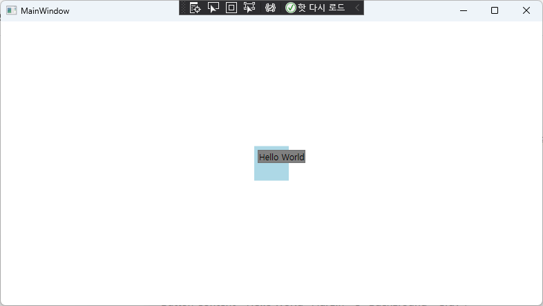
Button은 Canvas의 크기를 넘어서서 표시하는데, Button의 텍스트를 표시하기 위해 필요한 크기를 할당했기 때문입니다.
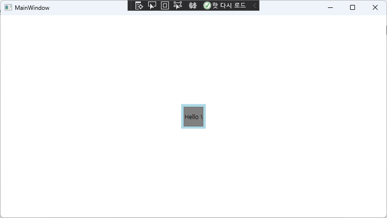
하지만 아래와 같이 Grid 컨트롤은 자식 컨트롤의 크기를 제한합니다.
<Grid Background="LightBlue" Width="50" Height="50">
    <Button Content="Hello World" Margin="5" Background="Gray"/>
</Grid>
실행하면 아래와 같이 Grid 내부에 Button이 잘려있는 것을 볼 수 있습니다.
이렇게 컨트롤마다 다른 결과를 보입니다.
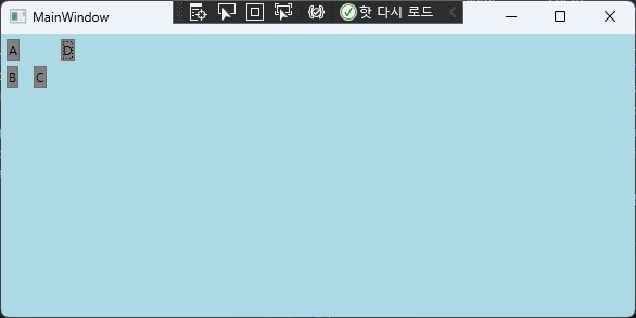
Canvas
Canvas는 WPF에서 가장 간단한 형태의 레이아웃입니다. 자식 컨트롤의 위치를 절대 좌표 위치를 기반으로 배치하고, 크기에 대해 자유롭습니다.
<Canvas Background="LightBlue">
    <Button Canvas.Top="0" Canvas.Left="0" Content="A" Margin="5" Background="Gray"/>
    <Button Canvas.Top="25" Canvas.Left="0" Content="B" Margin="5" Background="Gray"/>
    <Button Canvas.Top="25" Canvas.Left="25" Content="C" Margin="5" Background="Gray"/>
    <Button Canvas.Top="0" Canvas.Left="50" Content="D" Margin="5" Background="Gray"/>
</Canvas>
위와 같이 코드를 작성하고 실행하면 아래처럼 절대 좌표 위치 기반으로 컨트롤이 배치됩니다.
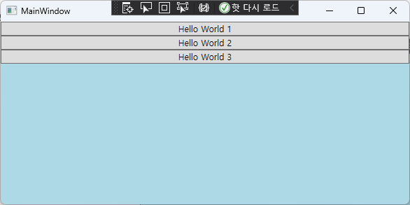
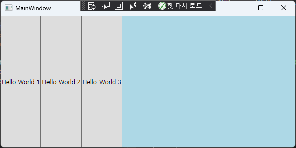
StackPanel
StackPanel은 자식 컨트롤들을 수평 또는 수직으로 일렬로 배열하는 레이아웃입니다. Orientation 속성을 통해 수평/수직을 결정할 수 있습니다.
<StackPanel Background="LightBlue" Orientation="Vertical">
    <Button Content="Hello World 1"/>
    <Button Content="Hello World 2"/>
    <Button Content="Hello World 3"/>
</StackPanel>
위와 같이 StackPanel을 입력해 줍니다. 실행하면 아래처럼 수직으로 배치됩니다.
만약 Orientation에 Horizontal이라고 입력하면 아래처럼 표시합니다.
DockPanel
DockPanel은 자식 컨트롤에 DockPanel.Dock 연결 속성을 입력하여 배치하는 컨트롤입니다.
아래와 같이 입력하면 한 눈에 알아볼 수 있습니다.
<DockPanel Background="LightBlue">
    <Button DockPanel.Dock="Left" Content="Hello World 1"/>
    <Button DockPanel.Dock="Right" Content="Hello World 2"/>
    <Button DockPanel.Dock="Top" Content="Hello World 3"/>
    <Button DockPanel.Dock="Bottom" Content="Hello World 4"/>
</DockPanel>
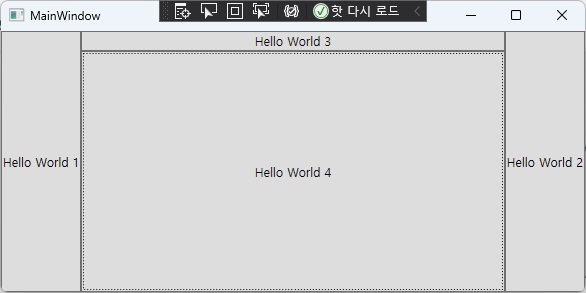
DockPanel은 영역을 분할하는 UI를 만들 때 유용하게 사용됩니다.
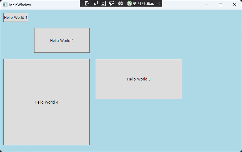
Grid
Grid는 WPF에서 많이 사용되고 유연한 레이아웃 입니다. 자식 요소를 행과 열의 격자 구조로 배치합니다. 행과 열은 Grid.RowDefinitions과 Grid.ColumnDefinitions에서 정의하고, 자식 컨트롤에서 위치하고 싶은 행과 열을 입력하면 됩니다. 아래는 Grid 예제입니다.
<Grid Background="LightBlue">
    <Grid.RowDefinitions>
        <RowDefinition Height="50"/>
        <RowDefinition Height="100"/>
        <RowDefinition Height="150"/>
        <RowDefinition Height="150"/>
    </Grid.RowDefinitions>
    <Grid.ColumnDefinitions>
        <ColumnDefinition Width="100"/>
        <ColumnDefinition Width="200"/>
        <ColumnDefinition Width="300"/>
    </Grid.ColumnDefinitions>
    <Button Grid.Row="0" Grid.Column="0" Margin="10" Content="Hello World 1"/>
    <Button Grid.Row="1" Grid.Column="1" Margin="10" Content="Hello World 2"/>
    <Button Grid.Row="2" Grid.Column="2" Margin="10" Content="Hello World 3"/>
    <Button Grid.Row="2" Grid.Column="0" Grid.RowSpan="2" Grid.ColumnSpan="2" Margin="10" Content="Hello World 4"/>
</Grid>
Grid.Row와 Grid.Column으로 행과 열의 값을 입력하면 해당 위치에 컨트롤이 배치됩니다.
또한 Grid.RowSpan, Grid.ColumnSpan을 사용하면 그리드의 셀을 병합할 수 있습니다.
github: https://github.com/3001ssw/c_sharp/tree/main/WPF/WPF_MVVM_1Week/03_Layout